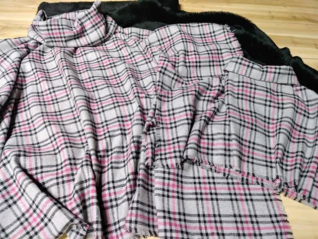
Why Your Scanner Settings Matter for Digitizing Fabric Samples
Scanner settings matter for digitizing fabric samples because a digital image is often used to make decisions about colour, texture, scale and suitability. A scan that looks acceptable on screen can still misrepresent the weave, flatten a raised surface or shift a warm neutral into an unusable shade.
Fabric is more demanding than a printed photograph. Fibres reflect light in different directions, translucent threads can create halos, and dark cloth may lose detail in the shadows. The scanner must capture enough information to preserve the character of the original sample without producing unnecessarily large files.
This is especially important for Australian designers, upholsterers, retailers and small studios working across distances. A customer in Brisbane may approve a fabric from a screen while the physical sample is in Melbourne, so a reliable digital workflow reduces uncertainty before postage, sampling or production.
Good scanning is a controlled process rather than a single “scan” button. Resolution, colour profile, exposure, file type and surface preparation all influence the result. Once these choices are understood, fabric libraries become easier to search, share and update.
Start With The Purpose Of The Scan
The best settings depend on what will happen after digitisation. A low-resolution image may be enough for an online swatch catalogue, while a textile designer studying a jacquard structure may need a much larger file with fine detail. Decide whether the scan is for viewing, printing, colour reference, pattern development or archival storage.
For general web use, a file around 150 to 200 pixels per inch can be practical when the physical sample is small and displayed at a modest size. A working master at 300 to 600 ppi gives more flexibility for cropping and enlargement. Scanning at an extreme resolution rarely creates useful detail if the scanner’s optics cannot resolve the fibre structure.
Keep a clean master separate from resized copies. The master should retain the best practical resolution and colour information, while web or email versions can be compressed for faster handling. This approach protects the original capture when a sample later needs to be printed or examined more closely.
Select The Right Scanning Mode
Use the scanner’s flatbed mode for most fabric samples. Automatic document feeders can crease, stretch or catch loose threads, and their lighting is rarely suited to textile surfaces. Place the sample flat, keep the grain aligned with the scanner edges and avoid pulling the material into shape.
A transparency or film setting is generally inappropriate for opaque fabric because it can produce strange exposure and colour results. Photo mode is usually a better starting point, followed by manual adjustments. Turn off automatic sharpening, dust removal and colour correction when they create halos or erase small textile details.
The preview scan is valuable. Inspect the darkest area, the lightest thread and any patterned edge before committing to a full capture. If the preview shows clipped highlights or blocked shadows, changing the file format later will not restore the missing information.
Set Resolution And Physical Scale
Resolution controls how much structure the file can describe. A plain cotton may look convincing at 300 ppi, while velvet, boucle, linen slub or embroidered cloth can benefit from 600 ppi. The extra detail is useful when a client needs to assess nap direction, stitch density or the spacing of a repeating motif.
Record the physical dimensions beside the digital file or in its metadata. A scan of a 100-millimetre swatch should remain identifiable as that size, especially when a repeating print is being assessed. Without a scale reference, a digital pattern can look visually correct while being reproduced at the wrong proportion.
For repeat designs, include a ruler or a measured reference strip in a separate documentation scan rather than leaving it across the main image. This keeps the presentation clean while preserving accurate information. Metric measurements are the natural choice for Australian studios, suppliers and print production.
Control Colour From Capture To Screen
Colour management begins before the scan. Clean the glass, use a neutral backing where appropriate and avoid placing a bright sheet of paper behind a thin or open-weave textile. Reflections from the scanner lid can affect pale fabrics, while a coloured backing can contaminate the appearance of translucent fibres.
Save important master files in a wide-gamut or well-defined colour space when your software and monitor support it. A calibrated monitor is essential for judging subtle greys, ochres, navy tones and near-white fabrics. If a screen is too cool or too bright, adjustments made by eye can move the digital sample further from reality.
A scanned image should be treated as a reference, not an absolute replacement for a physical swatch. Australian daylight varies strongly between locations, from bright coastal conditions in Sydney to different indoor lighting in Melbourne or Perth. For final upholstery, apparel or interior decisions, request a physical sample and assess it under the intended lighting.
Preserve Texture Without Creating False Detail
Texture is easy to damage with aggressive enhancement. Excessive sharpening can turn individual yarns into harsh outlines, while noise reduction may smooth away a subtle weave. Keep adjustments restrained and compare the processed image with the raw scan at 100 per cent magnification.
Raised materials require special care because the scanner’s fixed light can create shadows that are stronger than those seen in ordinary use. If texture is central to the design, make a second photograph under soft, angled light. The scan can provide colour and scale, while the photograph communicates pile, sheen and surface relief.
For a broader visual reference, designers may also study how colour systems communicate spatial information, such as the Istanbul metro map guide. The principle is similar: consistent colour choices help people interpret complex information quickly, provided the system is documented and applied consistently.
Organise Files For Australian Workflows
A useful file name can include the supplier, collection, colour name, sample code, date and scan resolution. For example, a naming pattern such as Brand_Collection_Sand_104_600ppi_2026 is easier to search than scan004. Keep the original sample code visible in a separate catalogue field as well.
Studios working with Australian suppliers often exchange files by email, cloud storage and project-management platforms. Large TIFF masters should stay in controlled storage, while JPEG or PNG previews can be shared with clients. If a file is sent to a printer, confirm the required colour profile, dimensions and format before export.
Useful file-handling habits include:
- Keep one untouched master scan and create edited copies from it.
- Store colour profile, resolution and physical sample size in the record.
- Use consistent names for supplier, collection, colour and sample codes.
- Back up the library in a separate location from the working computer.
- Photograph damaged, frayed or irregular samples before disposal.
If a fabric library contains customer names, project addresses or other identifying information, handle that information carefully. The Australian Privacy Act may apply depending on the organisation and its activities, so digital asset management should separate product data from personal information wherever practical.
Build A Repeatable Studio Standard
A written scanning standard prevents every team member from making different choices. Define the preferred resolution, colour space, file formats, naming rules, background treatment and quality checks. Include examples of acceptable and unacceptable scans so a new staff member can follow the process without guessing.
A local design business can also create a small reference set of difficult materials: black wool, white linen, reflective satin, sheer voile, velvet and multicoloured print. Scan these at the chosen standard and compare them with physical samples. This exposes weaknesses in the workflow before a major catalogue is processed.
For businesses developing a digital fabric library, a carefully presented supplier directory such as Aurora Design Fabrics can serve as a useful context for organising material names, collections and visual references. The key is to treat product imagery as structured information rather than a collection of attractive but inconsistent pictures.
| Scanning purpose | Suggested resolution | Recommended format | Main priority |
|---|---|---|---|
| Quick internal reference | 150–200 ppi | JPEG or PNG | Fast viewing and sharing |
| Online swatch catalogue | 200–300 ppi | JPEG or PNG with colour profile | Consistent colour and manageable size |
| Design and print preparation | 300–600 ppi | TIFF or high-quality PNG | Detail, scale and editing flexibility |
| Texture and weave study | 600 ppi where useful | TIFF plus optional photograph | Fibre structure and surface information |
| Long-term archive | 600 ppi if the sample warrants it | TIFF with embedded profile | Maximum practical preservation |
Use the physical swatch as the final authority when colour, texture or compliance matters. A well-made scan supports faster decisions, clearer client communication and better records, but it cannot account for every monitor, lamp or viewing environment.
Set up the scanner with a consistent standard, process a small batch, and compare each digital file against the original before expanding the library. For Australian studios managing remote clients, local suppliers and growing material collections, that simple discipline can turn scattered scans into a dependable working resource.