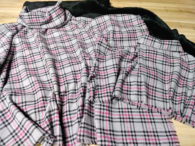
What Colour Calibration Means for Fabric Designers
Colour calibration is the process of making sure a colour is represented consistently from the first digital sketch through to the finished textile. It connects cameras, monitors, design software, printers, dye houses and fabric samples so that the blue, terracotta or soft green selected by a designer remains as close as possible to the intended result.
For fabric designers, this control is essential because cloth is a physical surface with texture, absorbency and light-reflective qualities. A colour that looks balanced on a laptop may appear dull on cotton, warmer on linen or considerably darker on velvet. Understanding colour management helps designers reduce sampling errors, communicate clearly with manufacturers and deliver collections that match customer expectations.
How Colour Calibration Works
A calibrated workflow begins with a monitor that displays colour accurately. Screen brightness, white balance, contrast and colour profile all influence what the designer sees. Without calibration, two people can open the same artwork on different devices and view noticeably different colours, even when the digital file has not changed.
Calibration tools measure a screen against a known standard and create a profile that corrects its display behaviour. A designer may use a colorimeter or spectrophotometer alongside software to set a suitable white point, luminance level and gamma. For textile work, a screen should also be viewed in controlled lighting rather than beneath a mixture of cool office tubes and warm household bulbs.
The aim is consistency, not an artificial promise that every screen and fabric will look identical. Digital colour is produced through light, while fabric colour is created through dyes, pigments, fibres and reflected light. Calibration narrows the gap between these two worlds and makes decisions more reliable.
Why Colours Change on Fabric
Fabric construction has a direct effect on colour appearance. A tightly woven cotton sateen may show a clean, saturated surface, while loosely woven linen scatters light and gives the same colour a softer, chalkier impression. Pile fabrics such as velvet can look different when brushed in opposite directions, and knitted surfaces may create small variations across a roll.
The fibre itself also matters. Cotton, viscose, wool, silk and polyester accept colour through different processes. A dye that performs beautifully on polyester may produce a different depth on natural fibres. Finishing treatments, optical brighteners, fabric preparation and washing can also change the final appearance.
Lighting is another major variable. A fabric can look correct under a design studio’s neutral lamps but shift under warm home lighting or bright Australian daylight. This is called metamerism: two samples appear to match under one light source but separate visibly under another. Reviewing swatches under more than one standard light source helps reveal this problem before production.
Building A Reliable Colour Workflow
Start with a colour brief that records the intended shade, material, finish and viewing conditions. A digital reference alone is rarely enough for a commercial textile project. Include physical swatches, approved lab dips, colour codes and notes about whether the target should look muted, vivid, warm, cool, deep or lightly washed.
Work in a suitable colour space and embed the correct ICC profile in design files. RGB is useful for screens and digital artwork, while print and production processes may rely on CMYK, spot colours or specialised textile colour systems. Converting files without understanding the destination profile can create unexpected changes, particularly in bright greens, intense oranges and deep blues.
Soft proofing can show how an image or pattern is likely to translate into a production process. It cannot fully simulate every fibre or dye recipe, but it can identify colours outside the printer or manufacturer’s achievable gamut. This allows the designer to adjust the artwork before paying for another strike-off or sample run.
A physical approval stage remains vital. Compare a lab dip or printed strike-off with the reference under consistent lighting, assess the whole repeat rather than a tiny patch and record the accepted sample. If a colour is adjusted, update the master file and production notes so that the revised version becomes the single source of truth.
Australian Conditions And Colour Decisions
Australian designers work across very different environments, from humid Brisbane and tropical Darwin to dry inland regions and cooler parts of Tasmania. Humidity can influence fabric handling, drying and finishing, while strong sunlight can make saturated colours appear especially vivid outdoors. A swatch reviewed in a Sydney studio may feel different when displayed in a sunlit coastal home.
The local market also includes independent fashion labels, interior studios, craft businesses and online retailers that often work with limited production quantities. Many businesses source fabric or manufacturing services from overseas, so a colour approval may travel between Australia, Asia and Europe before production begins. Clear files, physical references and written tolerances help prevent confusion across time zones and supply chains.
Retail settings create another challenge. Australian customers may see the same fabric in a Melbourne showroom, a Perth home and an online product photograph viewed on a phone. Store lighting, camera settings and device displays vary widely. Accurate product photography and honest descriptions are therefore part of colour management, even when the final material is supplied in person.
Measuring Colour Beyond Visual Judgement
Human vision is useful, but it adapts quickly to surrounding colours and lighting. A neutral grey wall can make a nearby beige appear pink, while a strong navy ground can make a small accent colour seem brighter than it really is. Measurements provide an objective reference when several people need to approve a textile.
A spectrophotometer measures how a surface reflects light and can record values in systems such as CIELAB. The difference between a target and a sample may be expressed as Delta E, often written as ΔE. A smaller value generally indicates a closer match, although the acceptable tolerance depends on the product, material and commercial purpose.
Colour standards such as Pantone references can support communication, but they should not be treated as a perfect substitute for a fabric sample. A paper guide and a textile surface absorb and reflect light differently. For critical projects, the approved material swatch should take priority, with the standard code used as an additional communication tool.
Design teams should also define an acceptable tolerance before production starts. A fashion print may allow a different range from a coordinated upholstery collection where several fabrics must sit together. Recording the tolerance avoids subjective arguments after manufacture and gives suppliers a clear target.
Practical Habits For Better Fabric Colour
Good calibration is a continuing studio practice rather than a single technical setup. Recheck monitors periodically, especially after moving a screen, changing room lighting or replacing hardware. Keep colour-critical work away from direct sunlight and avoid judging samples beside strongly coloured objects that can influence perception.
Store approved swatches flat or protected from excessive light, heat and moisture. Natural materials can age, fade or yellow, so note the approval date and keep a digital photograph for reference without treating the photograph as a replacement for the original. When a project is reprinted months later, compare the new result with the documented standard rather than relying on memory.
Useful habits for an Australian textile studio include:
- Calibrate design monitors with a measurement device and a consistent studio light source.
- Request lab dips, strike-offs or printed proofs before approving bulk production.
- Review samples under daylight, neutral commercial lighting and the lighting expected in the final setting.
- Record fibre content, finish, colour reference, approved sample date and allowable tolerance.
- Keep production files, ICC profiles and colour notes together in a clearly named project folder.
- Photograph finished samples for records, while using the physical swatch for final colour approval.
Calibration also improves conversations with printers, dyers and manufacturers. Instead of saying that a result looks “a bit off”, a designer can identify whether the sample is too dark, too red, less saturated or outside the agreed tolerance. That precision saves time and makes revisions easier to manage.
When a colour is commercially important, test it across the full range of materials in the collection. A signature rust may need separate approval on linen, cotton canvas and recycled polyester. Coordinating these results early is far more efficient than discovering after delivery that the fabrics match in a digital presentation but clash in a finished room or garment.
Colour accuracy supports creative freedom because it gives designers a dependable foundation for experimentation. Calibrate the screen, document the target, test the material and approve under controlled light before placing a production order. For fabric designers working in Australia’s varied climate and supply market, that disciplined process can protect quality, reduce waste and help every finished pattern communicate the original design intent. Begin with one colour-critical project, create a physical approval standard and make calibration part of the studio’s regular workflow.