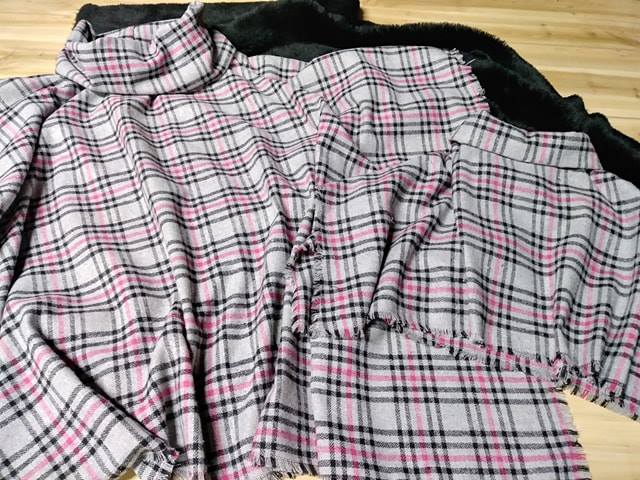
Understanding colour spaces for textile design and production
Colour spaces are the unsung backbone of textile design, defining how hues are created, translated, and reproduced across digital screens, printing presses, and dye baths. For Australian designers working across the country's vibrant fashion and interior markets, understanding the differences between RGB, CMYK, and LAB can mean the difference between a sample that pops and a production run that disappoints. Whether you are sketching a resort-wear collection in a Brisbane studio or specifying fabrics for a Perth hotel fit-out, these models shape every colour decision.
Unlike graphic design for screens, textile production involves physical materials that absorb and reflect light in complex ways. Cotton, linen, silk, and synthetic blends each interact with pigments and dyes differently, meaning a colour that looks perfect on your monitor may shift dramatically once it hits the loom or print machine. This is where colour spaces become critical tools, providing a common reference frame for designers, technologists, and manufacturers to speak the same language.
Australia's textile landscape is uniquely diverse, influenced by local fashion weeks in Melbourne and Sydney, a strong outdoor lifestyle that demands UV-resistant fabrics, and strict labelling laws enforced by the Australian Competition and Consumer Commission. Designers here must balance creative ambition with practical considerations, including compliance with the Australian Consumer Law and standards like AS/NZS 4399 for sun protection ratings. Mastering RGB, CMYK, and LAB is therefore not just a technical exercise but a professional necessity.
RGB in the digital design phase
The RGB colour space is the native language of screens. It creates colours by combining red, green, and blue light at varying intensities, producing the bright, saturated palette you see on your computer monitor, tablet, or phone. For textile designers, RGB is invaluable during the conceptual and digital illustration stages, allowing you to experiment with gradients, shadows, and complex textures in software like Adobe Illustrator, Photoshop, or Affinity Designer. You can preview how a print might look on a mockup, adjust colour harmonies, and share concepts with clients across the country via cloud platforms.
The principles discussed in minimalist digital design highlight how visual clarity and contrast play key roles when colour is stripped back to its essential elements. However, RGB relies on emitted light, which means its appearance is highly dependent on the device displaying it. A bold pink on a new MacBook may look muted on an older laptop, and neither will accurately predict how the colour translates to fabric. This limitation is why textile professionals must move beyond RGB before production begins, even though RGB remains the most flexible space for early exploration.
CMYK and the reality of printed textiles
CMYK stands for cyan, magenta, yellow, and key (black). It is a subtractive colour model used in almost all commercial printing, including textile printing methods such as digital pigment printing, reactive dye printing, and sublimation. Instead of emitting light, CMYK inks absorb certain wavelengths and reflect others, making it far more representative of how dyes and pigments behave on physical substrates. When you send a file to a printing service in Sydney or a dye house in Melbourne, CMYK is typically expected.
Most textile mills work within the CMYK space, though many advanced facilities now use expanded gamuts with additional spot colours like orange, green, and violet to achieve richer results. For Australian designers targeting the local market, understanding CMYK helps set realistic expectations. A neon coral that glows on screen in RGB may simply not be reproducible in standard four-colour process printing, requiring either a spot colour match or a fabric chosen for its ability to take dye vividly. Working in this model from the early stages also streamlines communication with Australian manufacturers, reducing back-and-forth and helping you stay within budget for small-run production.
The precision of LAB colour for consistency
LAB colour space, often written as Lab or CIELAB, was designed to be device-independent and perceptually uniform. It separates lightness from colour channels, with the a-axis representing red-green and the b-axis representing blue-yellow. This makes it exceptionally powerful for textile work because it allows you to measure and adjust colours with mathematical precision, regardless of the device or medium.
Many Australian textile mills and colour-matching services, particularly those servicing the automotive, upholstery, and technical textiles sectors, rely on LAB values to specify and verify dye batches. If a designer in Adelaide submits a LAB target, the dye house can objectively determine how much a sample deviates and adjust formulations accordingly. LAB is also invaluable for archival colour management. Over time, RGB and CMYK standards shift as software updates and hardware changes, but LAB provides a stable reference. For brands maintaining consistency across multiple product lines produced in different facilities, LAB acts as a universal translator.
You can convert a colour from RGB or CMYK into LAB, share it with partners globally, and trust that everyone is referring to the same target, even when working across different substrates and lighting conditions. This is especially valuable for Australian brands exporting to international retailers who must maintain exact colour standards regardless of where production occurs.
Practical workflow tips for Australian textile creators
A robust workflow begins with designing in RGB for flexibility and screen accuracy, then converting to CMYK for print production while monitoring which colours fall outside the gamut. Before finalising files, check critical colours against LAB values, particularly for branding or signature hues that must remain consistent across different fabric types. Keep in mind that Australian regulations require accurate fibre content labelling under the Australian Consumer Law, and colour consistency can affect perceived quality.
When sampling, request strike-offs or hand prints from your manufacturer, and evaluate them under multiple light sources, including the harsh midday sun common across much of Australia. For outdoor and upholstery fabrics, also consider AS/NZS 4399 sun protection standards, which may influence your colour choices and dye selections. Communicate your expectations clearly with your production partner, specifying illuminants such as D65 (daylight) or TL84 (store lighting), referencing the colour space you are working in, and providing physical samples whenever possible.
Many Australian textile businesses, from small-batch makers in Byron Bay to larger mills in Victoria, appreciate detailed specifications because it reduces errors and speeds up lead times. Designers seeking broader context on international topics can explore the journal at Aurora Design Fabrics, which includes entries such as i-convenienti-casino-europei-del-2026 alongside textile-specific resources that support the local creative community.
Avoiding common colour management mistakes
One of the most frequent errors is assuming that what you see on your uncalibrated monitor is true colour. Investing in a colour-managed workflow with a properly calibrated screen, ideally one that supports a wide gamut, is essential for serious textile work. Another pitfall is ignoring the effect of base fabric colour. A vibrant red printed on an off-white cotton will look different on a cream linen or a bright polyester, so always proof on the intended substrate.
Be cautious of fabric blends, as natural fibres like cotton and silk absorb colour differently from synthetics, and a colour formula that works for one may shift significantly on another. Australian designers working with local mills should also be mindful of seasonal variations in dye behaviour, particularly during humid summer months when dye uptake can vary. Finally, never skip the physical sample stage. Digital proofs and LAB values are powerful tools, but nothing replaces holding the finished textile under the lights where it will actually be used. For interior projects in sun-drenched Perth apartments or coastal homes in Queensland, this final check confirms the colour you specified will perform in the real Australian environment.
Ready to bring your textile vision to life with confidence? The team at Aurora Design Fabrics helps Australian designers navigate the complexities of colour management, from initial concept through to production. Whether you are developing a new collection, specifying fabrics for a commercial fit-out, or seeking advice on the best colour space for your project, our experts are here to help. Get in touch today to book a consultation and discover how professional colour management can elevate your next textile project.