Testing Color Profiles Before Production
Colour decisions that look reliable on one screen can shift considerably when artwork reaches a commercial press, dye-sublimation unit, textile printer or packaging line. Testing a colour profile before production gives designers and suppliers a controlled way to identify those changes while they are still affordable to fix.
The profile is a translation system between devices. It describes how a camera, monitor, proofing printer, RIP or press interprets colour values. A file may contain the same numerical values throughout the workflow, yet produce different reds, greens or neutral greys when each device uses a different gamut and ink set.
Australian production conditions add practical variables. A job moving between a designer in Melbourne, a print partner in Sydney and a manufacturer in Brisbane may pass through different monitors, software versions and output devices. Strong sunlight, warm office lighting and inconsistent viewing conditions can also distort visual judgements.
A dependable test therefore combines colour management with production knowledge. The aim is not to make every device display identical colour, but to predict the finished result, define acceptable variation and secure approval before materials, press time and freight are committed.
Choose The Working Colour Space
Begin by identifying the final output rather than selecting a profile simply because it is familiar. Offset print, digital print, wide-format signage, sublimated fabric and screen printing each have different colour limits. Ask the printer or converter which ICC profile, ink condition and rendering intent they support before converting the artwork.
RGB is often the best working space while images are being edited because it preserves a broad range of colour information. Adobe RGB can suit high-quality photographic workflows, while sRGB may be appropriate for simple digital output. CMYK conversion should usually happen at a controlled stage, using the profile supplied by the production partner.
A profile name alone does not describe the entire process. Paper stock, fabric coating, ink formulation, press calibration and finishing can alter the result. A coated-paper profile is unsuitable for an uncoated board, just as a general CMYK profile may misrepresent a six-colour textile printer with orange or violet channels.
Prepare Accurate Source Files
Before creating a proof, clean the document. Confirm the embedded profiles, image resolution, transparency settings, overprint attributes and spot-colour definitions. Remove unused swatches and make sure linked images have not lost their profiles during export. A missing profile can cause design software to guess how the colours should be interpreted.
Use the production partner’s preferred PDF standard and export settings. Check whether fonts must be outlined, whether black text should use a pure K channel and whether rich black is permitted for large areas. For fabric printing, inspect repeats, seams and edge-to-edge artwork because a small registration or alignment issue can become obvious across a long panel.
A short preflight routine can catch avoidable errors before colour evaluation:
- Confirm that every placed image has the intended ICC profile.
- Check total ink coverage against the printer’s stated limit.
- Review spot colours, metallic references and special white layers.
- Inspect overprint preview for hidden knockouts or muddy overlaps.
- Verify trim, bleed, scale and the final production dimensions.
Keep a master file in its original colour space and create a separate production copy for conversion. This makes revisions traceable and prevents an irreversible conversion from becoming the only version available. Name files with the profile, date and revision, such as range-banner_FOGRA39_v03.pdf, so a supplier can identify the approved condition quickly.
Create And Inspect A Soft Proof
A soft proof simulates the expected output on a calibrated display. In colour-managed software, select the destination profile, enable paper or substrate simulation when available, and turn on the option that warns about out-of-gamut colours. Compare the simulation with the original while viewing the image under stable, neutral lighting.
Monitor calibration matters more than screen size or price. Set a sensible white point and luminance for the environment, then recalibrate at regular intervals. A very bright screen can make a print appear dull, while a display surrounded by colourful walls can influence perception. In a Sydney studio with strong daylight, blinds or a neutral viewing area may be necessary for consistent decisions.
Pay special attention to brand colours, skin tones, smooth gradients and shadow detail. Highly saturated blue, green and orange often fall outside a CMYK gamut. The software may compress them, clip them or shift their hue. Test several rendering intents—usually perceptual and relative colorimetric—to see which preserves the visual priority of the artwork.
A soft proof is useful for screening decisions, but it is not a physical guarantee. It cannot fully show the texture of recycled stock, fabric weave, gloss, absorbency or the way an ink layer interacts with a coating. Record the monitor profile and proof settings alongside the artwork so another operator can reproduce the review.
Compare A Contract Proof
A contract proof is a physical reference produced under controlled conditions, often with an inkjet proofing system calibrated to the target press or output device. It provides a tangible standard for critical colours and gives the production team something more reliable than an email attachment or uncalibrated laptop display.
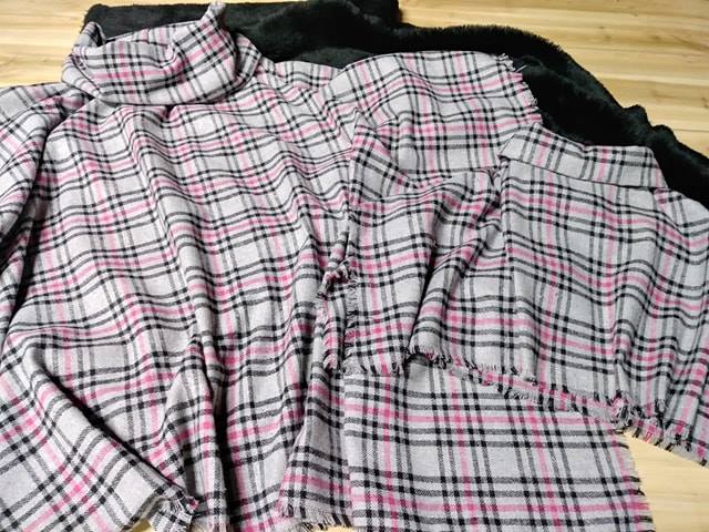
Ask for a proof on the closest practical substrate. If the final item is printed on cotton, polyester, vinyl or a coated board, a proof on ordinary office paper may show colour relationships but will not represent surface behaviour accurately. Some textile suppliers can provide a strike-off or small fabric swatch, which is especially valuable for large orders.
View the proof under a neutral daylight simulator or a consistent D50 booth. Australian offices often use warm LED lighting, and a proof approved under yellow light may look cooler in a print room. Keep the proof clean, flat and protected from direct sun, since fading and surface contamination can change the reference.
When reviewing, compare patches and real artwork together. A colour chart can reveal numerical differences, but the full design shows whether those differences affect hierarchy, legibility or brand recognition. If a client or production team is working remotely, share annotated proof photographs and supporting files through an agreed channel, such as this messaging workspace, while keeping the physical sample as the controlling reference.
Check Textile And Print Variables
Colour management cannot correct every production variable. On fabric, the weave, pretreatment, stretching and heat-setting process can affect density and apparent saturation. Dye-sublimation output may look different before and after transfer because heat changes how the dye bonds to polyester. Direct-to-garment and pigment systems can show variation caused by fabric colour and pretreatment chemistry.
For packaging and commercial print, substrate whiteness and ink absorption are equally important. Uncoated paper generally reduces contrast and saturation compared with coated stock. Large-format signage may be viewed outdoors in harsh Australian sun, where glare and fading influence the practical appearance. A colour that looks impressive indoors may need adjustment for a shopfront in Perth or an event banner in Adelaide.
Check these production factors before approving the final profile:
- Substrate colour, coating, texture and absorbency.
- Ink set, printer model, RIP version and calibration status.
- Viewing distance, indoor or outdoor use, and expected lighting.
- Finishing processes such as lamination, varnish, heat transfer or sewing.
- Tolerance for colour variation across panels, batches or suppliers.
Request a small test section when the order is colour-sensitive or materially expensive. For a national retail rollout, a test from the actual production line can expose differences between a laboratory proof and the finished batch. Compare samples after all relevant finishing steps, not just immediately after printing.
Release With A Documented Approval
The final approval should state exactly what was checked. Record the file version, destination profile, rendering intent, proof type, substrate, output device and date. Include notes for colours that are intentionally adjusted outside the original brand specification. This prevents a later operator from “correcting” a deliberate compromise.
Define acceptance limits in practical terms. A measured Delta E target may be appropriate for corporate colours, while visual comparison may be more meaningful for photographic fabric artwork. Agree on who has approval authority and whether the approved proof controls when a production sample differs slightly from the display.
Before sending files to production, complete a final release check:
- Confirm the approved artwork matches the released PDF or packaged file.
- Verify the output profile and conversion settings one last time.
- Attach the signed or recorded proof approval to the job.
- State any permitted colour, scale or registration tolerances.
- Archive the source, production file, proof and supplier correspondence.
A clear approval trail is especially valuable when work crosses Australian states, suppliers or time zones. It reduces ambiguity between a local designer, an overseas manufacturer and a Melbourne or Sydney finishing house. It also gives the team a useful reference for repeat orders, seasonal ranges and future colour-profile tests.
Test the profile on the actual workflow, compare a controlled proof, document the decision and release only the verified file. That disciplined sequence turns colour management from a last-minute rescue exercise into a dependable production safeguard. Save the approved proof and specifications with every job so the next run begins with evidence rather than guesswork.