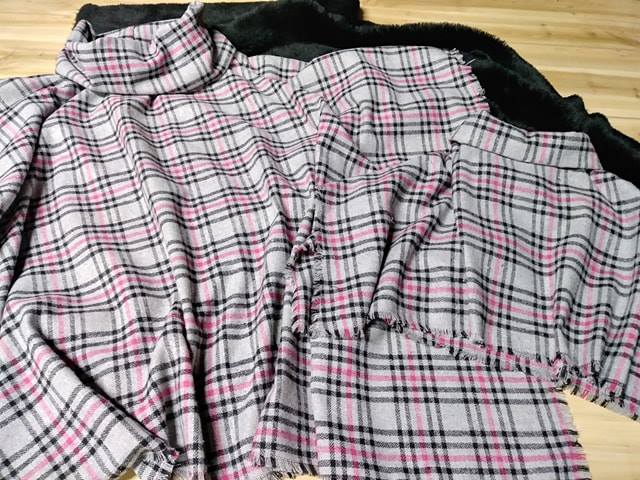
How to build a print ready fabric design mockup
Walk into any of Sydney's Inner West studios on a Saturday morning and you'll find a handful of textile designers wrestling with the same question: how do I turn this beautiful pattern in my head into something a printer will actually accept? A well-prepared digital mockup bridges the gap between imagination and the cutting table, and once you know the workflow, the process becomes far less mysterious than it first appears. Whether you're working from a Brunswick kitchen table or a proper studio in Fortitude Valley, the steps stay consistent.
A print ready file isn't simply a pretty preview. It's a technical document with specific resolution, colour profile, and repeat requirements that mills and digital printers expect. Investing a few extra hours at the mockup stage saves costly reprints, rejected runs, and the soul-crushing moment when a finished bolt arrives looking nothing like the screen.
Choosing your software and canvas
Most Australian designers start in either Adobe Photoshop or Affinity Photo, with a growing number switching to the Affinity suite to avoid subscription fatigue. Whichever program you choose, set up your canvas in centimetres rather than inches, since local printers quote in metric and you'll avoid rounding errors when scaling to standard fabric widths of 110cm or 150cm.
Begin with a working resolution of 300 dpi, which most mills in Melbourne's Collingwood district treat as non-negotiable. Build your file at the actual finished size of your pattern repeat, even if your design will ultimately scale down. This approach lets you catch tiny alignment issues that would otherwise appear as visible bands once printed.
If you're new to technical file prep, the fabric design journal walks through several Australian case studies with downloadable templates. Treat each project as a chance to refine your template library, and within a few weeks you'll have a base file that handles ninety percent of common scenarios.
Selecting the right base fabric
The base cloth you choose shapes everything from how your colours read to how the finished garment feels against the skin. Cotton lawn behaves differently to linen, and both behave differently to a polyester crepe, so mock up on the actual substrate you intend to print on. Many Brisbane designers visit local suppliers to grab thirty centimetre swatches before committing to a full run, which is a habit worth copying.
Consider the weight and weave. A heavy canvas mutes fine linework, while a loosely woven voile blurs small motifs. If you're designing for the warmer months along the coast, lighter substrates tend to suit the local market better, especially for the breezy dresses you spot at Finders Keepers markets in Sydney and Melbourne. Always request a strike-off before committing to a production run, since screens lie and fabrics tell the truth.
Building your repeat and colour palette
A half-drop, mirror, or brick repeat each creates a different visual rhythm, and your choice depends on the scale of the motif and the intended use. Large botanical illustrations usually work best with a simple straight or half-drop repeat, whereas geometrics can carry a more complex brick or oyster arrangement. Sketch the repeat mathematically, not by eye, using guides in your software to ensure tiles align seamlessly.
For colour, work in CMYK if your printer uses a four-colour process, but be aware that many Australian fabric printers prefer direct digital workflows using RGB-derived profiles. Request the printer's ICC profile and embed it in your working document from day one. Wet-season humidity in places like Cairns or Hobart can shift how colours appear on screen versus the printed cloth, so always work in a calibrated environment.
Constructing the digital mockup
Once your artwork tile is finalised, build a mockup that includes surface texture, lighting falloff, and the slight distortions you'd see on a real piece of cloth. Drop in a high-resolution photograph of your chosen substrate, mask your pattern to it, and adjust opacity until the weave shows through. Programs such as Photoshop handle this elegantly with smart objects and displacement maps, allowing you to swap patterns in seconds.
Adding subtle shadow and highlight gradients simulates the natural drape of fabric across a surface. A flat-laid sample reads differently to one folded over a chair back, so consider creating two or three mockup variants for your portfolio. Many studios in Adelaide's Leigh Street creative precinct photograph their mockups under consistent conditions to keep their social feeds visually cohesive.
For a more technical look at rendering fabric drape realistically, this detailed resource breaks down how light interacts with woven surfaces. Pair that knowledge with patient observation of real fabric samples, and your mockups will start looking less like screen art and more like the real thing.
Proofing for print readiness
Before exporting, run through technical validations. Check that all text is converted to outlines or embedded, that no layer styles depend on missing fonts, and that your colour values fall within the printer's gamut. Embedded profiles travel with your file, ensuring the printer's software reads your intent correctly.
Export a flattened TIFF at the actual finished size at 300 dpi, with a 5mm bleed on all sides if the printer requires it. Some printers accept layered PSDs or AFDESIGN files, especially for larger runs, but a flattened copy is always appreciated as a reference. Name your files clearly: pattern name, substrate, colourway, date, and your initials. A file called "final_FINAL_v3.psd" will cause problems the moment you hand it off.
Common pitfalls and how to avoid them
The most common mistake is treating the on-screen preview as gospel. Australian printers run spot printing too, so the colour conversion from RGB or hex values to ink simulation can drift dramatically. Always confirm a strike-off exists or request one, even if it costs an extra week and a hundred dollars. The alternative is reprints, which cost far more in time and materials.
Another pitfall is underestimating shrinkage. Cotton can shrink 3 to 5 percent, and loose weaves even further, meaning a tile that looks perfect on screen can pull apart after the first wash. Build shrinkage into your mockup scale and discuss expected shrinkage with your printer upfront. The mills around Sydney's Alexandria and Melbourne's Cremorne have seen every shortcut in the book, so ask them what they recommend for your specific substrate.
Final checks before sending the file
Before pressing send, run through these essentials:
- Confirm resolution is 300 dpi at finished size, not at scaled-up size
- Embed the printer's ICC profile and verify colour values fall within gamut
- Include a 5mm bleed if required, plus clear crop marks
- Convert all text to outlines or embed fonts
- Provide a separate flattened reference file alongside the working file
- Name files with pattern, substrate, colourway, and version
- Keep a backup of the working file with layers intact, stored locally and in the cloud
Once the file is prepped and proofed, send it through and keep an eye on your inbox for the strike-off. Most Australian printers turn strike-offs around within five to ten working days, though it can stretch during the pre-Christmas rush between November and early December. Use the gap to refine your product descriptions, plan your photography, and prepare for the launch.
A thoughtful mockup is your strongest sales tool, your clearest briefing document, and your first defence against expensive misprints. Share your finished files confidently, brief printers clearly, and let your pattern speak for itself on the finished bolt.