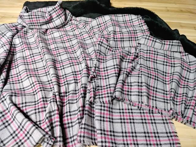
How to calibrate your monitor for accurate fabric colour matching
Choosing fabric online depends heavily on the colour shown on screen. A muted sage, warm ivory or deep navy can look quite different when it arrives, especially if your monitor is too bright, too cool or using an inaccurate colour profile. Proper calibration gives you a far more dependable reference before ordering fabric for clothing, upholstery, curtains or craft projects.
A calibrated display cannot remove every variation between a digital image and physical cloth. Fibre type, weave, dye lot, surface texture and room lighting all affect perception. It can, however, reduce avoidable screen errors and help Australian customers make better decisions when comparing fabric swatches, product photographs and design samples.
Why screen colour drifts
Every monitor leaves the factory with different brightness, contrast and colour settings. Retail displays are often tuned to look vivid under bright showroom lighting, which can make reds appear stronger, blues appear colder and whites appear unnaturally bright. A laptop may also change its appearance automatically when its battery level, viewing angle or surrounding light changes.
The age and type of display matter as well. Older screens can develop uneven brightness or a colour cast, while inexpensive panels may show a narrower range of colours. Viewing a monitor from above or beside the centre can make a fabric image seem lighter or darker. Even two people looking at the same product page may describe the shade differently.
Web browsers and image files can introduce another variable. An image without a suitable embedded colour profile may be interpreted differently by different software. For consistent results, use a modern browser, keep your operating system updated and avoid judging colour from screenshots or compressed images copied from social media.
Prepare the room and display
Start by controlling the light around the screen. Direct sunlight through a window can shift your perception during the day, which is particularly noticeable in bright Australian rooms in Brisbane, Perth or Sydney. Close blinds during critical colour checks, and avoid placing the display directly beneath a strong ceiling light or beside a sunny window.
Neutral, steady lighting is preferable. A soft lamp with a colour temperature close to daylight is more useful than a warm yellow table lamp or a blue-white LED downlight. If you are working in the arvo, check that the room has not changed from cool morning light to warmer afternoon light before making a final fabric decision.
Clean the display carefully with a suitable microfibre cloth, then let it warm up for at least 30 minutes. Set the monitor to its factory or standard picture mode, rather than a vivid, cinema or gaming preset. Disable automatic brightness, eye-comfort filters, night mode and any blue-light adjustment while calibrating, because these features alter the colour balance.
Use calibration hardware and software
The most reliable approach uses a colorimeter, a small sensor that rests against the screen. Devices such as an X-Rite or Calibrite colourimeter measure patches displayed by calibration software and create an ICC profile for the monitor. That profile tells compatible applications how the display reproduces colour, allowing images to be shown more predictably.
Before starting, set the monitor’s brightness to a comfortable level rather than maximum output. The calibration software normally guides you through white point, gamma and luminance settings. A common starting point is a D65 white point and gamma 2.2, but the recommended values may vary with your lighting, display and production workflow. Follow the manufacturer’s instructions rather than changing advanced controls at random.
When calibration finishes, save the profile with a clear name and ensure your operating system has selected it as the active display profile. Calibrate again every four to eight weeks if colour decisions are frequent, or whenever the monitor is moved, the room lighting changes significantly or the screen begins to look different. Professional textile studios may calibrate more often.
Check profiles and physical references
A calibrated monitor is only useful when the image itself is managed correctly. In your editing or design application, confirm that the document uses a recognised colour space such as sRGB for general web images. For print or production work, use the colour profile requested by the printer, manufacturer or designer. Do not convert files repeatedly without understanding the effect, as each conversion can alter the appearance.
Use a neutral test image containing skin tones, greys, gradients and saturated colours to check the result. Grey should look neutral rather than green, pink or blue, and gradients should appear smooth without obvious bands. A white area should look clean without dazzling detail disappearing into the screen brightness.
Physical swatches remain the final reference for important purchases. Fabric reflects light differently from a flat digital image, and a pile fabric such as velvet can appear to change shade as its surface direction shifts. Order a sample when a close match matters, particularly for a bridal outfit, a sofa, curtains or a set of cushions. Keep the swatch beside the intended room materials and inspect it in both daylight and evening lighting.
Compare fabric colour in real conditions
Screen matching works best when the viewing process resembles the fabric’s final use. If the material is for a Melbourne living room, compare the swatch near the actual window, flooring and wall colour. A cool grey wall can make a beige fabric look warmer, while timber floors and warm lamps can make neutral colours appear creamier.
Australian homes also vary widely by region. A fabric selected for a sunlit Queensland room may look different from the same colour in a shaded Tasmanian study. Strong northern light, coastal glare and tinted windows all affect perception. Checking the sample at several times of day gives a more practical result than relying on a single monitor view late at night.
When shopping online, keep the browser window at its native size and avoid display zoom that makes images appear soft. Read the product description for colour names, composition and finish, but treat names such as “linen”, “stone” or “ocean” as descriptive rather than exact standards. If you need several metres, verify that the quantity comes from the same dye lot where possible. Before paying, review the selected options and quantities in the fabric shopping cart so an accidental colour or variant choice does not create a costly delay.
Build a repeatable colour-checking routine
Consistency matters more than chasing a supposedly perfect screen. Use the same monitor, browser, room and lighting whenever you compare fabrics. Keep a written record of the monitor profile, calibration date and brightness setting. This is especially useful for small design businesses, interior decorators and makers who revisit a project weeks after the first colour decision.
If a fabric must match an existing item, compare a physical swatch with the item instead of trying to identify the colour from memory. Photographing the item under mixed lighting can create a misleading reference, so use a neutral background and even light. For business work, request supplier samples and keep approved swatches labelled with product name, dye lot and date.
- Calibrate with a colorimeter rather than relying only on your eyes.
- Turn off night mode, blue-light filters and automatic brightness before checking colour.
- Keep the room lighting steady and avoid direct sun on the display.
- Use sRGB for ordinary online images unless a different profile is required.
- Compare important choices with a physical fabric swatch.
- Recalibrate regularly and record the active monitor profile.
- Inspect the final sample beside the materials and lighting used in its real setting.
Accurate fabric colour matching is a managed process rather than a single monitor setting. Set up the room carefully, calibrate the display, use colour-managed files and confirm important choices with physical samples. Make these steps part of your normal purchasing routine before ordering fabric, and your online colour decisions will be clearer, more consistent and better suited to the conditions in Australian homes and studios.